Welcome to our periodic spotlight feature where we take a look at the concept art and design of a game or film. The intent here is to get the creative juices flowing, remind people what's out there and what's being done, and to not lose sight of the quality of professional work. We can also discuss what works and maybe what doesn't, what you dig, or what you DONT dig.
-----------------------------------------------------------------
Game: Guild Wars
www.guildwars.com/Release Date: 28 April 2005
Company: ArenaNet
www.arenanet.com/Lead Concept Artist: Kekai Kotaki
kekaiart.com/
Wow, we're only 2seconds into this post and you can SEE that these guys GOT DA SKILLS! Some wicked artistry went into visualizing the world of the Guild Wars series, and it's going to be nothing but pure concept porn from here on out. These posts just keep getting bigger and bigger... this one is going to be HUGE (I pitty you guys on slow connections, sorry). I will say, however, as much as I love this work, I have a few criticisms detailed below up for discussion (in addition to my drool). But those are just my observations, you form your own, this is still AWESOME art!

Guild wars is an episodic fantasy MMORPG (although the developers insist it is more accurately a “competitive-online-role-playing game” or CORPG) set in the world of Tyria. The games include Guild Wars (2005), Guild Wars: Factions (2006), Guild Wars: Nightfall (2006), Guild Wars: Eye of the North (2007), and Guild Wars 2 which is slated for 2011. The stuff we will look at today is a mix of all of them.

"Study it! DON'T be ENTERTAINED by this!" - Pixar told us a few weeks ago. It seems like a mountain of art was created for this series and, thanks to the generosity of ArenaNet, a great deal of it is freely available on the web. This makes our THIRD medieval universe that we are studying, but this one (like the others) brings a new aesthetic to the table. The series entails 4 games, over the course of which dozens of artists have contributed. As a result, we have quite a range of artistic flavours and yet when you look at this work you can usually TELL what universe it's from.

When you think of the art of Guild Wars, chances are, you are thinking of the art of lead concept artist Kekai Kotaki. A HUGE deal of this work is by, or influenced by, him. He is a force to reckon with and his personal style seems to epitomize the style of Guild Wars (I should note he was not lead concept artist on the first game). He concepts like a traditional painter - illustrative, painterly, and smoky. He has a love for old metals and eye-less bodies or full-cover helmets. His figures constantly look windswept, similar to old Baroque art where cloth was always caught up in a torrent of air and muscles and bodies contorted over each other.

But why is this unique? What tells you that? What defines the look and style of this art? How do you know this is Guild Wars and not Mass Effect? How would you describe this style? Well, to start, the designs are definitely more rooted in reality than those of, say, Warcraft. We are no longer swinging six-meter swords or shielded by Hummer sized shoulder pads, and instead are dealing with a more down-to-earth 14th century knights-in-shiny armour sensibility with a magical twist. We are leaning toward more natural anatomy; less stylized muscles and more realism in the painting.

In fact we are full out render - shiny metals and exotic fabrics. That was true for Project Offset as well, but Guild Wars branches out in different ways yet still: downplaying dragons and ogres and favouring more wondrous spiritual creatures, magical enigmas, anthropomorphic beasts, animals, elementals, and demons. It has a very gladiatorial feel to it; everything feels like the cow-head-wearing warrior that gets brutally chopped down by Russell Crowe and his pals in the Coliseum. A lot of the shape influence, markings, patterns, and ornaments seem to come from real life cultures and mythologies. There are clear design cues being borrowed from Chinese, Japanese, African, Celtic, Persian, Egyptian, and Arabic cultures, mixed in to a blend with things like Norse, Greek, and Native mythology and superstition.

So what we get are demon Samurais, oriental lion-dragons, frog people, ghostly witch doctors, and Medusa-like Pharaohs. These concepts are highly rendered; tight edges, and a lot of specular highlights.

Everything here is sharp, spiky, and angry. It seems like their philosophy is: when in doubt, put more spikes and gold trimmings. They seem pretty game for anything - tattooed bears in armour? Sure why not. Everything is unrestrained - no obvious set of rules can be detected - just don't make the armour unbelievably thick. They seem to favour Earthly tones from highly saturated colour - giving the concepts a realistic, gritty, dark heavy and damaged quality. There is an apparent emphasis on materials and fabrics. A lot of attention goes into minute details like stitching, cloth patterns, trimmings, and tassels.


This stuff is pretty awesome but I think the one thing these designs might suffer from, in the words of Cleveland, is just "too-muchery".
Here is a list of design considerations from the Dominance War forums:
1. Silhouette – distinct, easy to read, interesting.
2. Asymmetry – seems to work better and make a more interesting silhouette.
3. Primary and secondary read detailing – primary read detailing being larger details and secondary as details within details (even smaller details).
4. Detail distribution – How is the detailing spread over the form. Is the detail distribution logical? Does your eye have a chance to rest?
5. Cohesiveness of form and overall composition – Do organic and inorganic shapes combine convincingly? Do the shapes all flow together well?
6. Colouring – Good colour scheme? How well does it support the concept?
This idea of primary, secondary, and tertiary "reads" is really interesting - and its true. When you look at something, the first thing you notice is the overall shape (primary) - is it a car or is it a bus? Then you will break down that shape and notice the secondary shapes (wheels, windows, doors, shoulder pads, chest piece, legs), and then lastly the tertiary read which is the detail that rests INSIDE the secondary shapes(exhaust, grill, lights, buckles, jewels, spikes, etc).


There is so much attention to detail going on in the tertiary read here that the silhouettes aren't as impressive as they could be. Coming at this from an animation perspective, these characters are all kind of short on personality. I can't tell what kind of behaviour these soldiers would have - they all look sort of the same. Part of this is due to the anatomy being fairly generic in SOME of these concepts (not all). Particularly the anatomy of the humans - really standard - hardly any muscles influencing the shapes - their limbs look like cylinders. There's no big fat peaceful guy, agile ninja type dude, or all out warrior chick.

A lot of the creature's seem pretty random too; it almost looks like they tried to squeeze a bunch of mouths and muscles into a chest piece and loincloth. Personally, some of this stuff I don't really connect with - the draftsmanship is beautiful but I don't really FEEL the character or creature. In some cases its borderline "trying too hard". Whether or not they are successful, you be the judge. Concept artists spend a lot of time thinking hard about a design READING and LOOKING alright (sillhouette, shape, colour, texture, etc, all that good stuff) but in the end its really the audience who decides if something works or doesn't... doesn't it? If a villain passes all the design tests and looks ok, but the gamer thinks he's ridiculous and doesn't believe it, then can that really be considered a successful design? It didn't fulfill its purpose.

It may go without saying, but I think a design is harder to remember when there is too much detail. If you look at these, they look fantastic, but can you REMEMBER a particular one? Is there one that sticks with you? Can you go away, then in 10minutes replicate one these armour designs from memory?
Having looked at a lot of concept art, one of my main observations is that: while every design should work on several levels, it should ALWAYS work on the" Halloween Costume" level.
...Umm-come again?
By that I mean, I think no matter how detailed a design is, fundamentally a GOOD design can be simplified into a Halloween Costume and still be RECOGNIZABLE. For example, Darth Maul, Boba Fett, Illidan, Halflife's Combine, Batman, Superman, Mario and Luigi, Master Chief, Mega Man, Samus, etc. I don't think I could boil ANY of these down to a Halloween costume (well, maybe the chick in the hat with the horns)- in general they are too abstract and complicated. Now I'm not saying that every character design is made for the intent or purpose of going trick-or-treating, but my point is that there should be something iconic about it.

Having said that, a huge part of CONCEPT ART is brainstorming. It's important to not forget that NOT ALL of this art was used - if at all. The whole point is to generate a ton of visual ideas and keep the ones that work. Another part of design is also how something makes you FEEL, and in that regard, these concepts are pretty bitchin'. There is no question this guy here wants some blood.

But also, no ‘design’ can ever really be defined by how it LOOKS. Other things like animation play a HUGE role in defining a creatures personality and weight – is it slow, lumbering, and peaceful, or is it wicked fast and violent? As senior concept artist James Hawkins says, there’s no point designing a huge bad ass villain if he just sits there and doesn’t do anything interesting. It’s important to constantly think beyond the visual portion of a design and consider its function and motion.
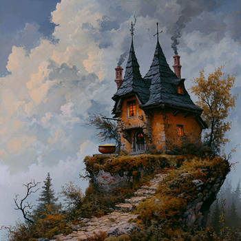
The environments are pretty spectacular. A lot of crazy ideas are going on here. While this doesn't apply to all of the art, I'm going to call its style "Photoshop-Sketchy".

A good portion of this work here is by the amazing concept artist Jamie Jones - living proof that hard work and being observant can go a long way. Jamie studied at Corcoran College of Art and Design for only two years before dropping out and heading to Arenanet. He claims he learned more from studying the work of old artists like John Singer Sargent (above) than anything his teachers could ever teach. Words of wisdom! He now works at Bungie and is concepting for Halo: Reach.

You look at these environments and think - DAMN - everything feels RIGHT. It looks impressive. A spectacle. It comes back to that sense of verisimilitude I mentioned in previous articles. I want to GO to these places, explore them, find out why they are in the condition they are in, the history, and the story. Back story is so important in anything whether its games or film. As we say in animation, "The world exists before you enter it, and continues to exist after you leave it."


These are clear rips from Asian architecture; one of the defining ingredients to the Guild Wars style being real-world influence. It also makes you realise that in order to illustrate and conceptualize things from our imagination, you have to at least be able to depict things as they REALLY are. It's hard to create new worlds when you can't yet create the one we live in. So draw, draw, draw
 (Smile)")

Well that is quite the body of work. I think the guys at ArenaNet are trying to push the fantasy genre in new directions with creativity unleashed. Having not played these games myself I can't comment further on anything besides the artwork here, but if you have some insight or light to shed, by all means please do so
PEACE